前端开发时遇到一个比较特殊的需求,花了点时间写出来这组件,效果如下
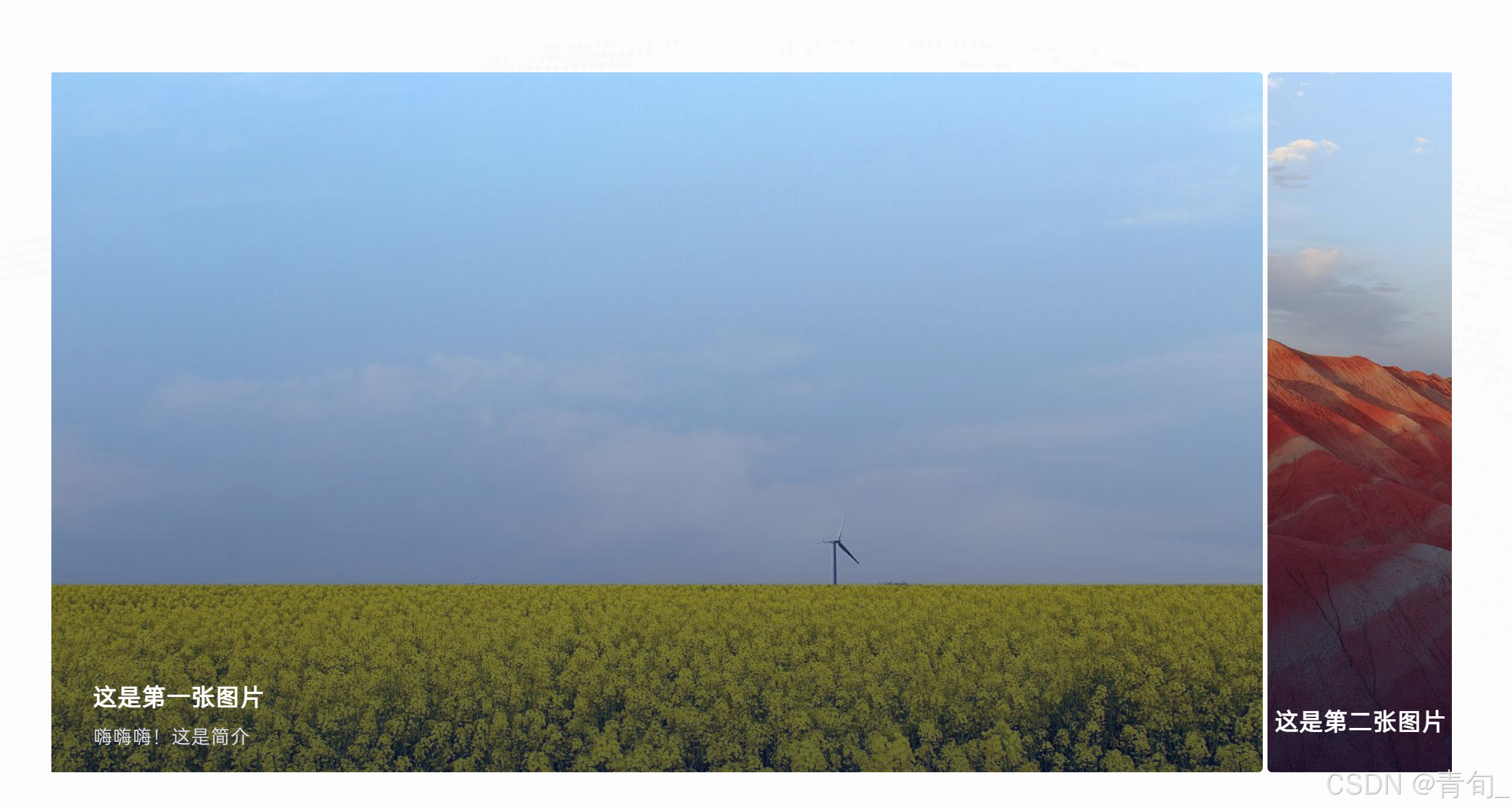
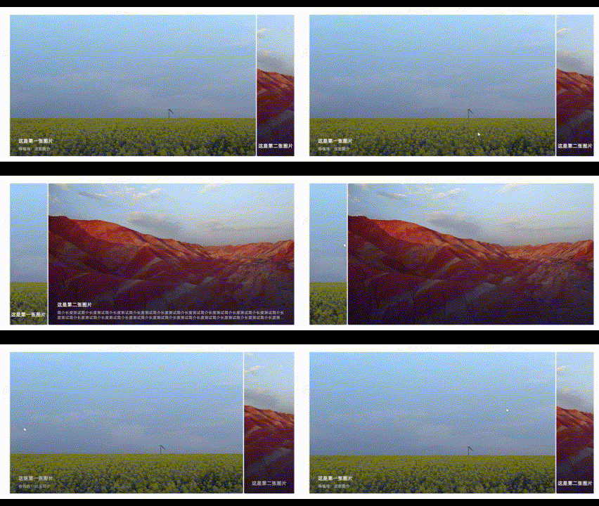
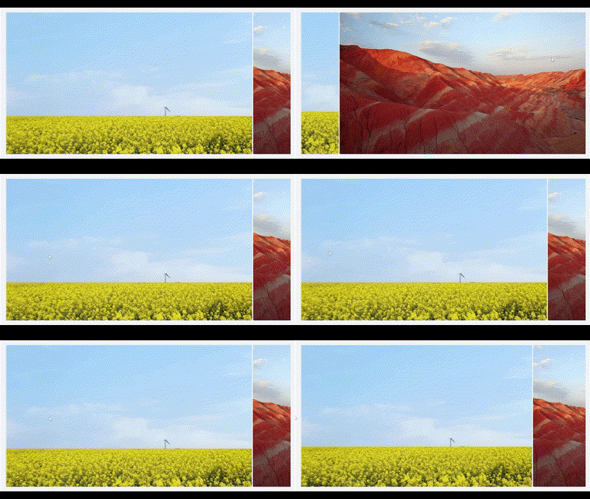
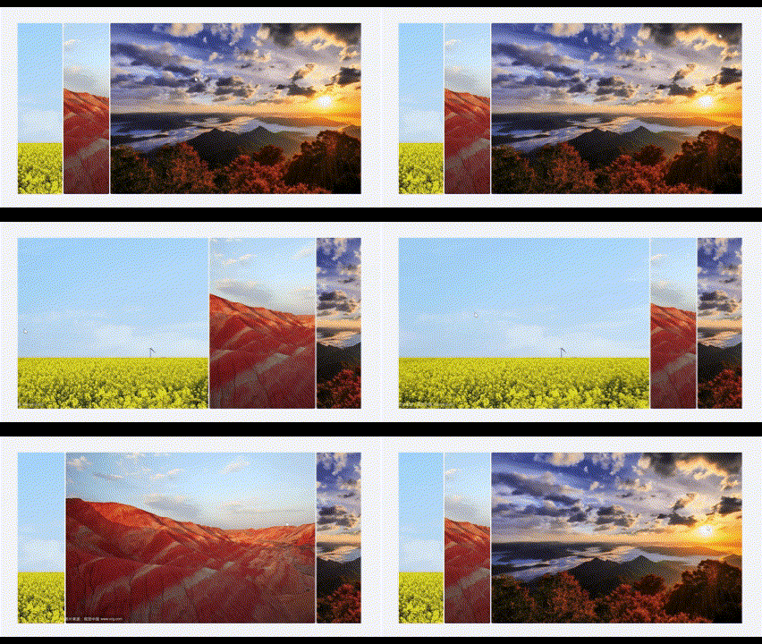
该组件支持多张图片显示,可以根据图片数量自适应宽度。
如果传入的数据没有标题简介的话,则图片下侧没有阴影
- <template>
- <div class="container" :class="{ 'bg-transparent': bgFlag }">
- <div class="content">
- <div class="title">{{ moduleData.module.name }}</div>
- <div class="carousel">
- <div class="carousel-item"
- v-for="(item, index) in moduleData.children"
- :key="index"
- @mouseover="expandItem(index)"
- :style="{
- backgroundImage: `linear-gradient(180deg, rgba(0, 17, 128, 0.00) 0%, rgba(0, 13, 54, 0.60) 100%), url(${initImgPath() + item.module.imgUrl})`,
- width: activeIndex === index ? `calc(1200px - 160px * (${moduleData.children.length} - 1))` : '160px',
- }"
- >
- <div class="carousel-item-content">
- <transition name="fade">
- <div v-if="item.module.title"
- class="carousel-item-content-title"
- :key="activeIndex === index ? 'visible' : 'hidden'"
- :style="{
- width: activeIndex !== index ? '150px' : '100%',
- justifyContent: activeIndex !== index ? 'center' : 'left',
- }">
- {{ item.module.title }}
- </div>
- </transition>
- <transition name="fade">
- <div v-if="item.module.profile"
- v-show="activeIndex === index"
- class="carousel-item-content-profile">
- {{ item.module.profile }}
- </div>
- </transition>
- </div>
- </div>
- </div>
- </div>
- </div>
- </template>
-
- <script>
- import initImgPath from "@/myHooks/initImgPath.js";
-
- export default {
- props: {
- moduleData: {
- type: Object,
- required: true,
- },
- bgFlag: {
- type: Boolean,
- default: true,
- },
- },
- data() {
- return {
- activeIndex: 0, // 当前激活的页面索引
- };
- },
- methods: {
- initImgPath,
- expandItem(index) {
- this.activeIndex = index; // 记录当前展开的图片索引
- },
- },
- };
- </script>
-
- <style scoped>
- .container {
- position: relative;
- background: url("@/assets/images/9bed669d7b993dc75ead81d19db9fdaf.png") lightgray 50% / cover no-repeat;
- box-shadow: 0px 2px 35.686px 0px rgba(5, 42, 68, 0.04), 0px 4px 12.907px 0px rgba(5, 42, 68, 0.03);
- display: flex;
- flex-direction: column;
- padding: 20px 360px 100px 360px;
- justify-content: center;
- align-items: center;
- }
-
- .container::before {
- content: "";
- position: absolute;
- top: 0;
- left: 0;
- right: 0;
- bottom: 0;
- background: rgba(244, 247, 251, 0.95);
- z-index: 1;
- }
-
- .bg-transparent::before {
- background: rgba(255, 255, 255, 0.95); /* 半透明的白色背景 */
- }
-
- .content {
- position: relative;
- z-index: 2;
- width: 1200px;
- }
-
- .title {
- color: #222635;
- text-align: center;
- font-size: 32px;
- font-style: normal;
- font-weight: 700;
- line-height: normal;
- letter-spacing: 1.6px;
- padding: 60px;
- }
-
- .carousel {
- width: 1200px; /* 整体宽度 */
- height: 600px; /* 整体高度 */
- display: flex;
- justify-content: center;
- overflow: hidden;
- gap: 4px;
- }
-
- .carousel-item {
- display: inline-flex;
- width: 160px; /* 未展开状态宽度 */
- height: 600px;
- padding: 534px 38px 40px 38px;
- flex-direction: column;
- justify-content: flex-end;
- align-items: center;
- flex-shrink: 0;
- border-radius: 4px;
- transition: width 0.3s ease; /* 动画效果 */
- background-size: cover;
- background-position: center;
- }
-
- .carousel-item-content {
- width: 100%;
- position: relative;
- display: flex;
- justify-content: center;
- align-items: center;
- flex-direction: column;
- bottom: -20px;
- padding: 0;
- }
-
- .carousel-item-content-title {
- width: 100%;
- color: #FFF;
- display: flex;
- font-size: 20px;
- font-style: normal;
- font-weight: 600;
- line-height: normal;
- letter-spacing: 1px;
- margin-bottom: 10px;
- }
-
- .carousel-item-content-profile {
- width: 100%;
- color: #D9DDEB;
- font-size: 16px;
- font-style: normal;
- font-weight: 400;
- line-height: normal;
- letter-spacing: 0.8px;
- overflow: hidden; /* 隐藏超出部分 */
- display: -webkit-box; /* 使用 flexbox */
- -webkit-box-orient: vertical; /* 垂直排列 */
- -webkit-line-clamp: 2;
- text-align: left;
- opacity: 1;
- }
-
- .fade-enter-from {
- opacity: 0;
- }
-
- .fade-leave-from, .fade-leave-to {
- display: none;
- }
-
- .fade-enter-active, .fade-leave-active {
- transition: opacity 0.5s ease;
- }
- .fade-enter, .fade-enter-to /* .fade-enter-active below version <2.1.8 */ {
- opacity: 1;
- }
-
- @font-face {
- font-family: 'OPPOSans';
- src: url('@/assets/fonts/OPPOSans-R.ttf') format('truetype'); /* 确保路径正确 */
- font-style: normal; /* 如果有斜体,可以添加 */
- }
- </style>
这个组件的动画比较特殊,首先给carousel-item设置一个0.3秒的width变化动画,因为需要做鼠标光标悬停在当前图片的展开动画。
然后这里并没有使用:hover做鼠标悬停的样式,因为涉及到图片自适应,需要根据当前图片数量来计算出展开后的大小。(未展开默认宽度为160px)
width: activeIndex === index ? `calc(1200px - 160px * (${图片数量} - 1))` : '160px',html
这样图片的样式就算写好了,接下来开始写标题和简介的样式
图片组件内的标题组件不管是展开还是未展开的状态都是一定会显示的(当传入的数据里面有title的情况),简介组件只有在图片展开的情况才会展示。所以要添加 v-show="activeIndex === index" 这个条件。
然后根据展开和未展开的情况给标题组件添加不同的样式
因为title没有v-show,所以在使用<transition>前要添加 :key="activeIndex === index ? 'visible' : 'hidden'" 来强制 Vue 重新渲染该组件
接着就是动画的处理了,我设计的是在每次展开图片时,将标题简介设置为完全透明,再通过动画将其渐变为可见状态。
最后在最外层元素carousel组件上添加样式
一个非常简单的多项卡片展示组件就算做好了